A jacket can fit comfortably, carry the details you enjoy and still leave you unsure about its color. That is not a contradiction. Kibbe, style essence and personal color discussions often arrive together in the same search results, but they do not ask identical questions. It helps to separate the decisions before trying to combine them in an outfit. Begin with a silhouette you can live in, choose the visual details you want, and consider color without asking any one label to solve every part of getting dressed.
Identify the question before choosing a framework
Searching for Kibbe vs style essence can make two vocabularies look like rival answers to one test. A more useful starting point is to ask what you hope to change. Are your jackets uncomfortable? Do outfits feel too plain? Are you trying to make a bright shirt work with clothes you own? Each concern points toward a different garment decision.
David Kibbe describes an approach involving Image Identity and individuality. Style essence language, including the work associated with John Kitchener, concerns visual impression and can include individual blends. Those broad descriptions do not provide a conversion chart or authorize fixed prescriptions for a stranger. They can provide background for practical wardrobe questions without becoming a substitute for an individual consultation.
Color adds another set of questions: how a shade looks beside other colors, how much contrast you want, and whether a garment belongs with your existing pieces. Different color approaches have their own terms. A seasonal palette, Kitchener's custom color work and Kibbe Color should not be treated as interchangeable services or labels. You can still make useful outfit choices while leaving those classifications unresolved.
Do not translate one label into another
A label from one framework does not automatically supply a label in another. If you have explored a Kibbe Image Identity, that does not settle your style essence preferences or seasonal color category. Likewise, enjoying an angular necklace does not establish a body type. Similar words can describe different ideas, and an online chart may conceal those differences behind a tidy row of matches.
For a wardrobe note, replace the translation with a description. Instead of “this identity means I need dramatic accessories,” write “I like a visible angular earring with this smooth neckline.” Instead of “my palette requires soft details,” write “these two muted colors make the textured cardigan easier to combine.” The second version gives you something observable and repeatable.
| Your actual question | A useful garment check | What it does not establish |
|---|---|---|
| Does this silhouette work for my day? | Sit, reach and walk; check the garment's drape and ease | A definitive Image Identity |
| Do I want more visual detail? | Compare one accessory or trim while keeping the base outfit | A personality trait or fixed essence blend |
| Can I wear this color with my wardrobe? | Try it beside two familiar outfits in steady light | A complete personal color analysis |
| Why does this outfit feel busy? | Remove one competing focal point and compare | A rule forbidding you from wearing that detail |
Establish a silhouette you can move in
Before comparing details, choose a reliable outfit shape. That might be a softly structured jacket over a knit with straight trousers, or a fluid dress with a comfortable layer. Start with pieces you already wear. The purpose is a stable base for comparison, so there is little value in choosing a theoretically suitable garment that makes you adjust the sleeves all morning.
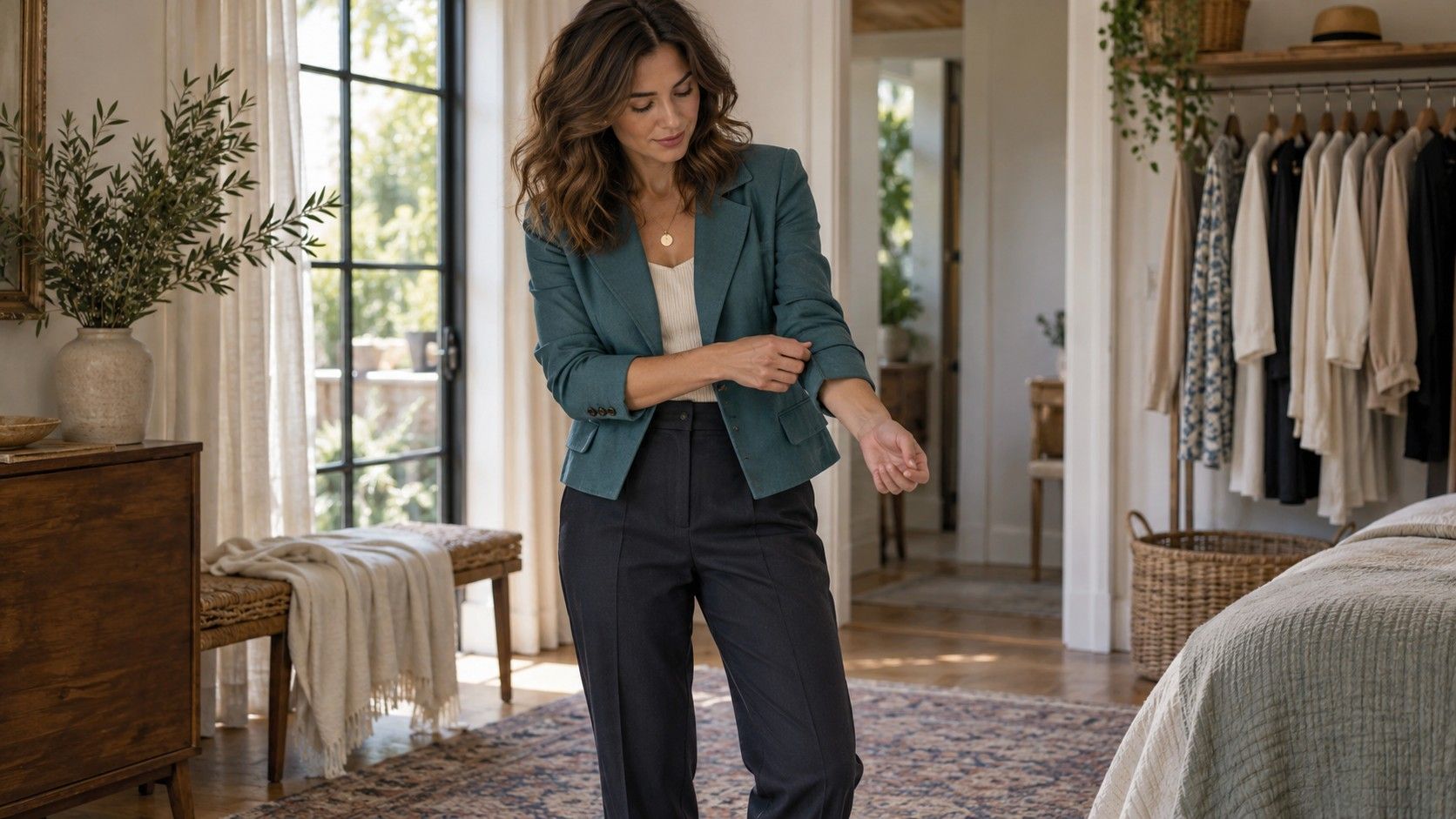
Check the jacket with the layer you intend to wear underneath. Reach forward, sit down and put on your bag. Notice whether the collar stays comfortable and the hem settles when you move. For trousers, check the waistband while seated and the hem with the intended shoes. These observations describe the clothes and your activities; they do not need to become a judgment about your proportions.
If you like the overall line but the piece pulls, consider size, cut, fabric and alteration options separately. A different shoulder construction or a little more room may solve the problem while keeping the visual effect. When the same issue appears in several garments, record the construction feature they share before concluding that a whole style direction is unavailable to you.
Change the impression through small details
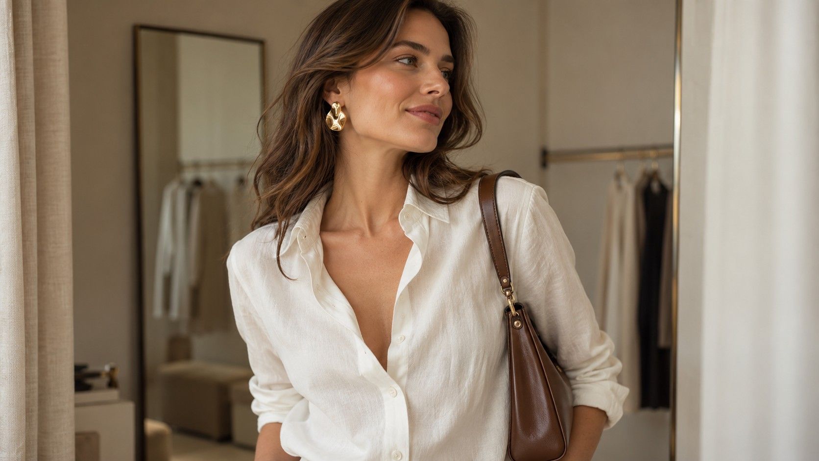
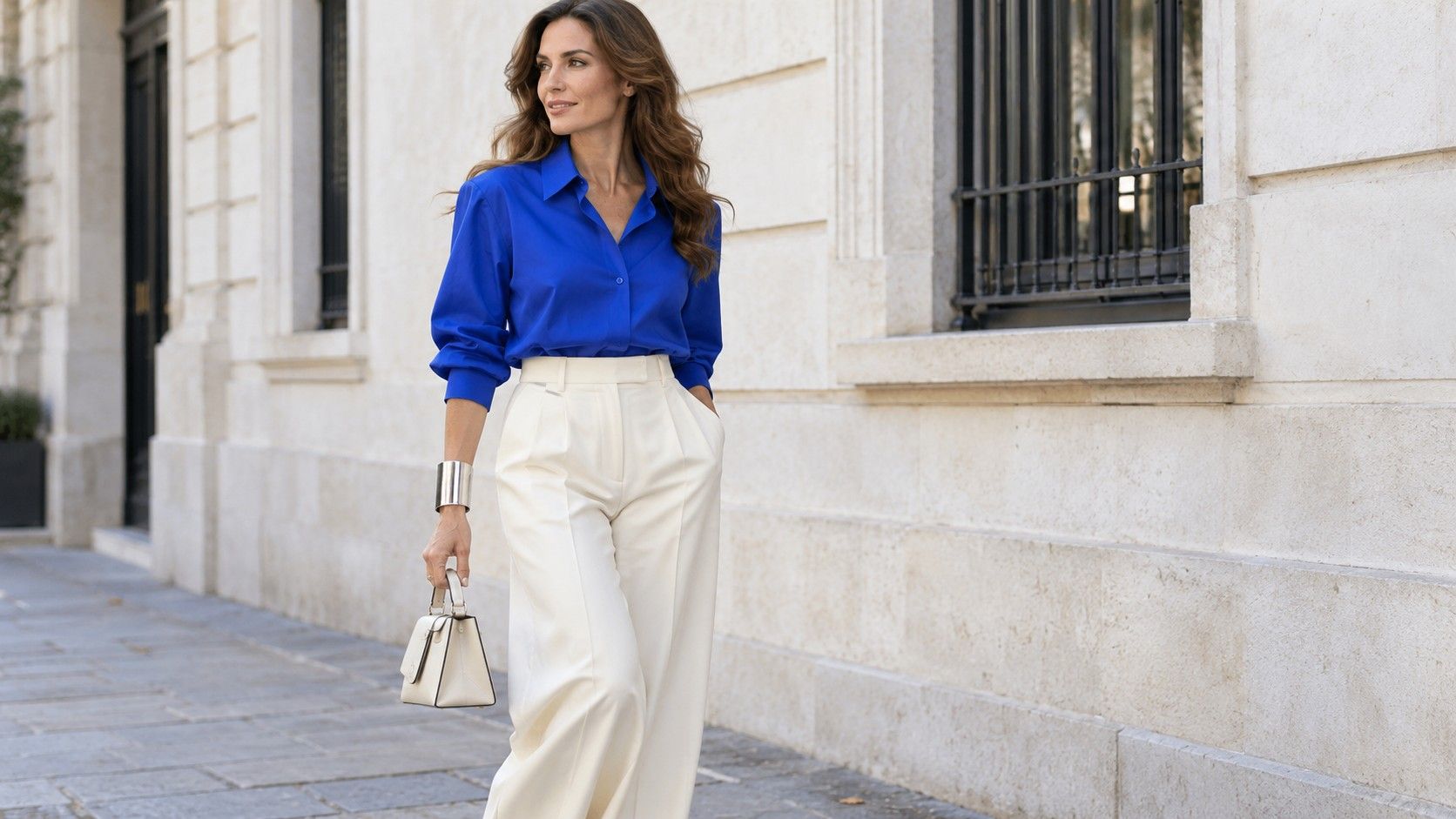
Once the base is comfortable, explore style essence as an optional vocabulary for details. Keep the jacket, trousers and top, then compare a smooth metal cuff with a small woven bracelet. The first may give a cleaner focal point; the second may make the outfit feel more tactile and informal. Neither accessory changes your body or requires you to claim a new identity.
Try scale as a separate variable. With an uncluttered neckline, compare a narrow pendant with a larger sculptural one in a similar metal. Ask how much attention you want the necklace to draw, and whether it interferes with the collar. If the larger piece feels excessive, its shape may still appeal in a smaller version. “Too much here” is more precise than “wrong for me.”
Texture is another way to change the impression while keeping a familiar silhouette. A smooth fine-knit cardigan and a softly brushed one can create different finishes over the same shirt. Look at how the texture sits beside the trouser fabric and bag. Check comfort too: a surface that looks inviting may feel irritating against your neck, and that is enough reason to choose another fabric.
Limit the experiment to one or two changes. A wide belt, contrasting scarf, patterned bag and bold earrings may all be enjoyable, but adding them at once makes it difficult to identify what you liked. Put the extras nearby and add one. Stop when the outfit has the amount of detail you want for the day, even if the combination crosses several descriptive categories.
Make color a decision of its own
Color and body type analysis are often bundled together online, yet a comfortable silhouette does not dictate the shade of a blouse. Keep the shape and detail steady when you explore color. If you own similar tops in two colors, compare them with the same trousers and accessories. If you do not, lay a scarf across the neckline to consider a color relationship without buying another garment.
Use reasonably consistent daylight for a comparison and avoid a strong colored wall reflecting onto the clothes. A phone camera may change exposure or white balance between pictures, so do not treat photographs as a precise color assessment. Look at the outfit itself, then check whether the shade connects with the coat, shoes and bag you actually use.
Consider contrast before hunting for a perfect palette name. A pale top with dark trousers creates a clear division; a medium top with similar-depth trousers creates a quieter transition. Both can be intentional. Repeat the comparison with the same belt so its color does not become a second experiment. Decide whether you want the eye to pause at the waist or move more continuously through the outfit.
You can also move a color instead of rejecting it. A bright shade that feels too dominant as a jacket might be enjoyable in a bag, sock or narrow scarf. Conversely, a color you love may deserve a larger area. Placement changes the effect without turning the color into a universal good or bad choice. Your existing wardrobe and preferences provide a useful starting point while a formal analysis remains optional.
Bring the three decisions back into one outfit
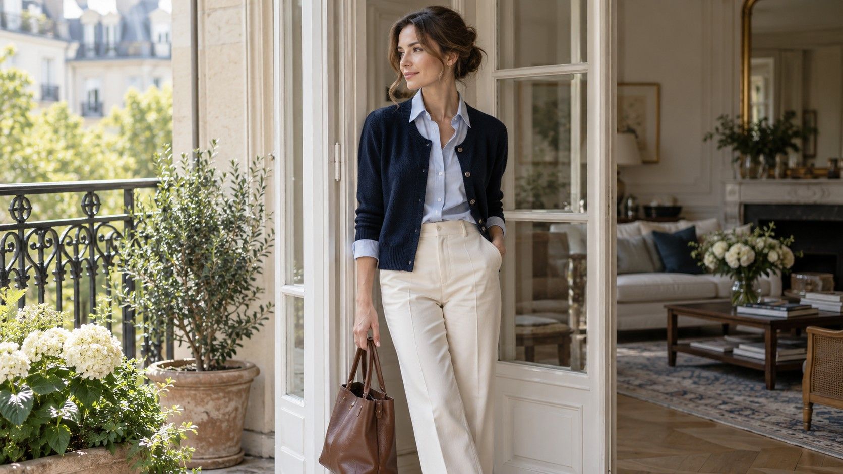
Write a short outfit note with three separate lines: the silhouette, the details and the color relationship. For example: “comfortable straight trousers and an open cardigan; curved earrings and a smooth bag; navy with a lighter blue top.” Each line answers a specific question. If the finished outfit feels dull, you can adjust an accessory before replacing the trousers or reconsidering every style label.
For a second version, retain two lines and change the third. Keep the silhouette and colors but swap the curved earrings for an angular cuff. On another day, keep the silhouette and details while changing the blue top to cream. You are comparing manageable choices, not testing whether you belong in a system. A result can be as modest as preferring the cream top with that particular cardigan.
If you later seek advice from a named styling system, bring these concrete observations with you. They describe what you wear, where the difficulties occur and which details you enjoy. Until then, a useful wardrobe can grow from small decisions you can explain: the sleeve allows movement, the accessory adds the right amount of interest, and the colors work together in clothes you want to wear.