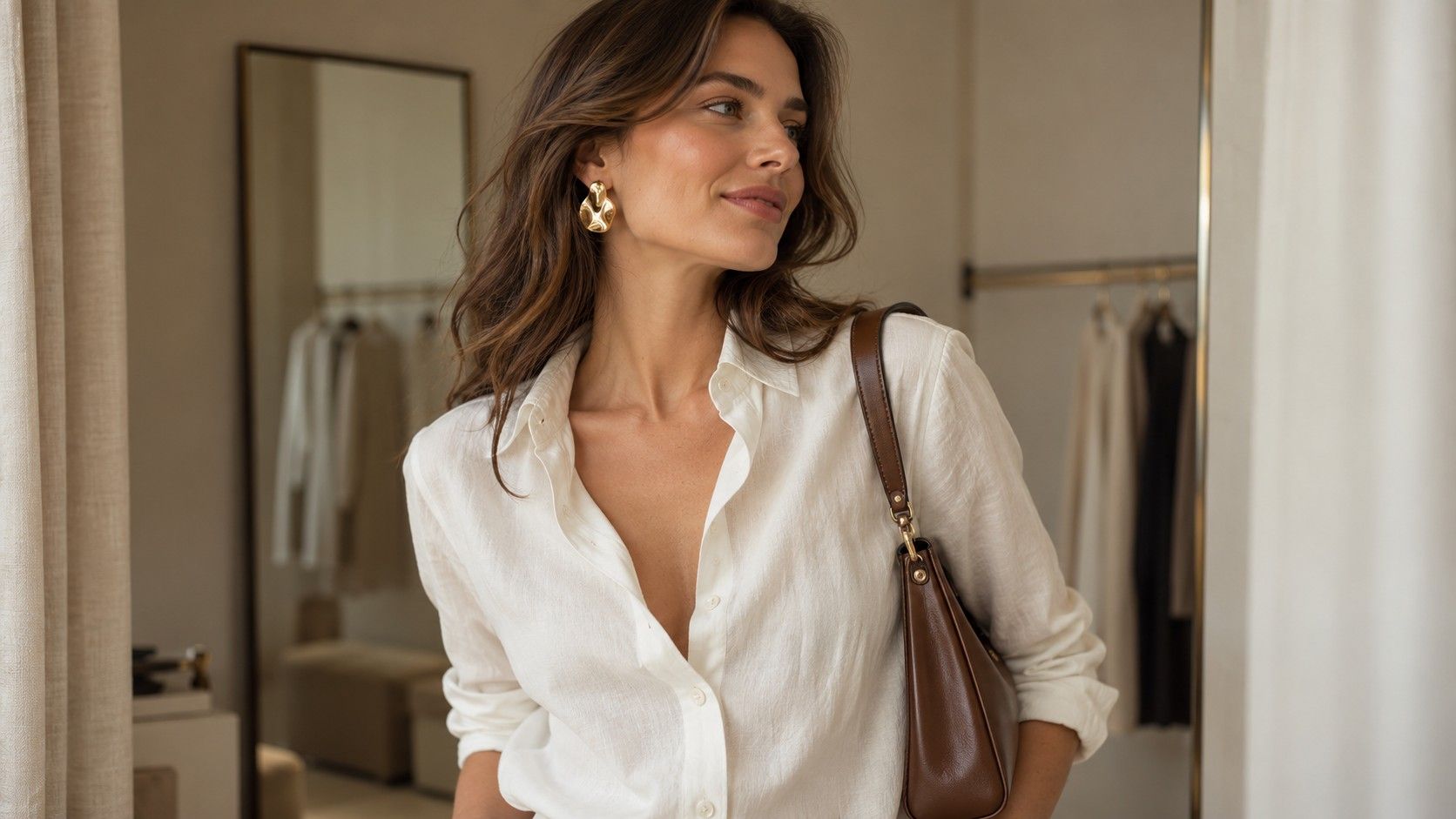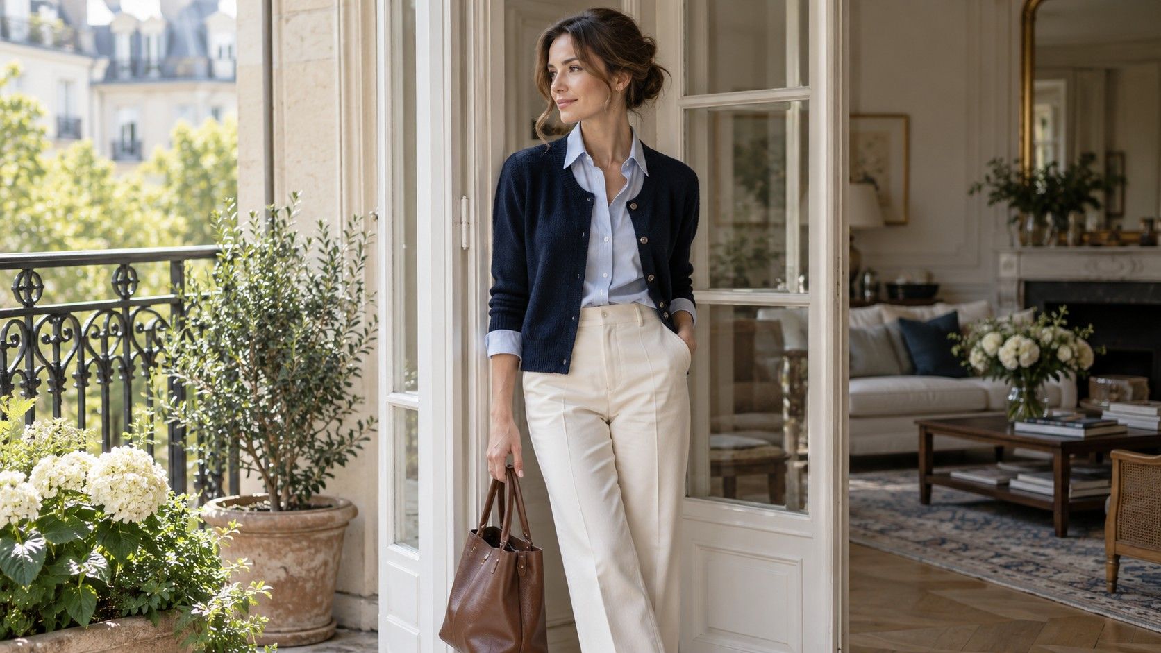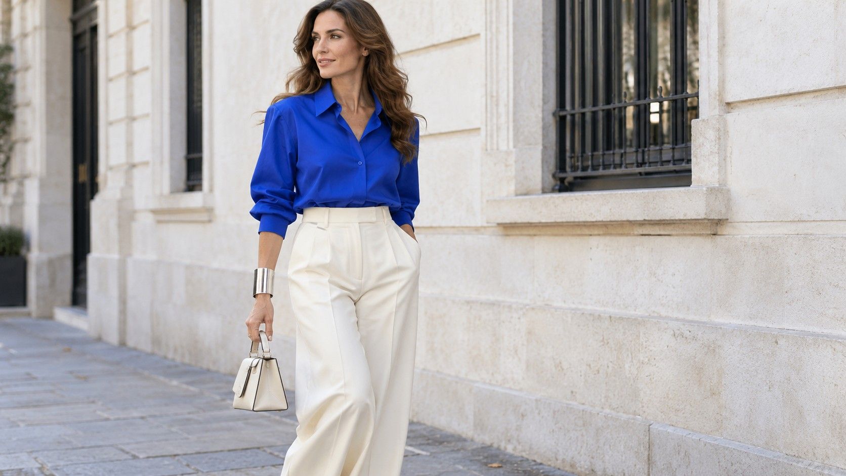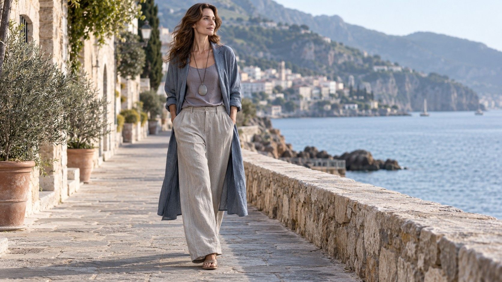
A roomy jacket can feel right while its color feels too strong; a gentle blue can be appealing in a top whose fabric hangs awkwardly. Treat those as separate clothing decisions. If you use Flamboyant Natural and Soft Summer as references, compare outline, texture and color one at a time instead of asking a single label to solve the whole outfit.
Separate the silhouette from the palette
The search for flamboyant natural soft summer outfit ideas brings two different interests together: a preferred direction for clothing and a way of thinking about color. They need not produce a special list of garments. Begin with something concrete, such as a softly structured jacket over straight trousers, then decide which colors you enjoy in that combination. These are optional experiments rather than official instructions for either system.
Keep the silhouette stable for the first comparison. Put the same jacket over a muted blue top and a brighter blue top, with the same trousers and shoes. Look at each in similar light. You may prefer the quieter color, the brighter one or neither. That choice says something useful about this outfit without confirming a seasonal category or an Image Identity.
Then keep the color stable and change the garment. A blue-gray shirt with a firm collar and a blue-gray draped top can create quite different effects. Look at the opening around your neck, the sleeve volume and the way the fabric falls when you sit. A color you enjoy can appear in more than one silhouette; an uncomfortable cut does not make the color wrong.
Avoid trying to extract clothing permissions from height, shoulders, facial features or a photograph. You can try a longer line, an open neckline or a larger accessory because the effect interests you. The relevant checks are fit, movement and whether you want to repeat the outfit. Leave room for a close-fitting top or a crisp jacket if that is what works on the day.
Compare texture in similar muted colors
Begin with two surfaces in a similar shade: a smooth blue-gray cotton shirt and a fine textured knit, for instance. Wear each with the same trousers. The knit may spread the color across raised stitches and shadows, while the shirt shows a more even area. Notice which relationship you enjoy instead of assuming that muted color always requires a rough or brushed fabric.
A quiet palette can become indistinct when every surface has the same softness. Try a washed mauve top beside gray trousers, then add a smoother belt or a bag with a clear outline. The extra definition may be enough. If you prefer the entirely soft version, keep it; there is no obligation to create a sharp focal point in every outfit.
Check texture where garments meet. A loose knit over a raised waistband can bunch, and a long shirt may catch on textured trousers rather than falling smoothly. A smoother base layer or a shorter upper layer can solve this without changing the colors. Run your hand over the join, bend and sit. A surface that looks interesting in a shop still needs to behave well against the rest of the outfit.
Take care with almost-matching shades. Two gray-green garments may look related indoors and quite different outside. That difference can be pleasant when it seems deliberate, especially if the textures clearly differ too. If you want a matching set, inspect the pieces together in daylight before assuming the similar names on their labels guarantee the same color.
Try a larger accessory without more bulk
Scale is not the same as weight. A broad hollow earring can be light, while a small solid metal piece may feel heavy. A wide flat bag can create a substantial outline without protruding far from the body. When you want to try a larger detail, compare its visible size and its physical comfort separately. There is no need to accept aching ears or an awkward handle for the sake of a style reference.
With a soft gray shirt and trousers, try a medium rectangular bag in muted blue or dusty rose. A clear edge gives the quiet colors a visible boundary. If the bag feels too formal, choose a softer construction while keeping a similar size. If it disappears against the outfit, a slightly deeper shade may give the definition you wanted without adding hardware or decoration.
Jewelry offers another controlled comparison. Put on a small earring, then one with a broader curved outline, leaving the neckline and hairstyle as they normally are. Turn your head to check whether it meets the collar. Look from several steps away as well as close up. The larger version may feel balanced with a roomy shirt, or it may draw more attention than you want.
Use one accessory change before adding a second. A broad cuff, large bag and substantial necklace can each work individually while feeling cumbersome together. Keep the object that contributes most to the outfit and makes sense for the activity. A day carrying shopping may suit a comfortable crossbody bag better than a striking rigid handle, regardless of how either is categorized.
Keep light layers from losing their outline
Pale and muted layers can merge, especially when they are all soft and loose. To make the outline easier to see, try a slightly deeper top beneath an open jacket, a clearer neckline or a sleeve rolled to a stable cuff. A dusty navy vest beneath a light gray-blue shirt gives a visible opening without requiring a black border. Compare the contrast in the actual light where you will wear it.
Length can make the layers clearer too. A short light jacket over a longer top creates two visible edges; a longer open jacket may let the top appear as one continuous area inside it. Neither arrangement is compulsory. Check whether the hems remain separate as you walk or catch on each other. If they bunch, a smoother fabric underneath may help more than changing the length.
For warm weather, consider the complete outfit without the jacket. A comfortable tank and trousers should still provide the coverage you want when the outer layer comes off. Put the jacket in your bag and see whether it is manageable to carry. A heavy textured piece can be too warm even when its color looks light and its cut looks relaxed.
For cooler weather, test the same outfit inside a coat. A roomy shirt sleeve may fold inside a narrow coat sleeve; a textured scarf may cover the neckline you carefully chose. Move the defining detail to an area that stays visible, such as the coat opening or bag. Keep sufficient room to bend your arms and reach forward. Visual ease is much less enjoyable when the layers restrict ordinary movement.
Write down the combination you would wear again
After a successful comparison, record what worked in plain clothing terms: blue-gray shirt, straight gray trousers, dusty rose bag, rolled sleeves. Add the surface and weight if they matter. A smooth fine shirt behaves differently from a thick brushed one, even when both are the same color. Those specifics make the note useful when you dress again.
Include the practical outcome. Did the shirt stay comfortable in a warm room? Did the bag hold what you needed? Did the sleeves remain in place? A photograph can capture the color relationship but miss a slipping strap or a neckline you kept adjusting. Note those issues while you remember them, then change one detail next time rather than discarding the whole combination.
Use your notes to shop more selectively. If a soft blue shirt already does the job, another blue shirt needs a reason to earn space: easier washing, a useful sleeve length or a fabric better suited to the weather. Take the existing garment with you if possible when comparing colors. A description such as muted lavender can cover shades that behave quite differently beside your own clothes.
You can keep the references without making them permanent obligations. A preferred color may change with the garment, the lighting or the rest of your wardrobe. An accessory scale you enjoy for an evening may feel impractical for work. Return to the combination you actually want to wear: a comfortable outline, surfaces that work together and colors you are pleased to see when you open the wardrobe.