A moodboard full of pale flowing dresses can feel miles away from the deep colours you enjoy wearing. Another may suggest crisp black-and-white combinations when you prefer soft, closely related shades. Style essence and seasonal color can become easier to use when you separate colour from garment detail. You can borrow a curve, texture or rhythm from a reference without buying its entire palette or treating its label as a requirement.
Identify the conflict in the outfit
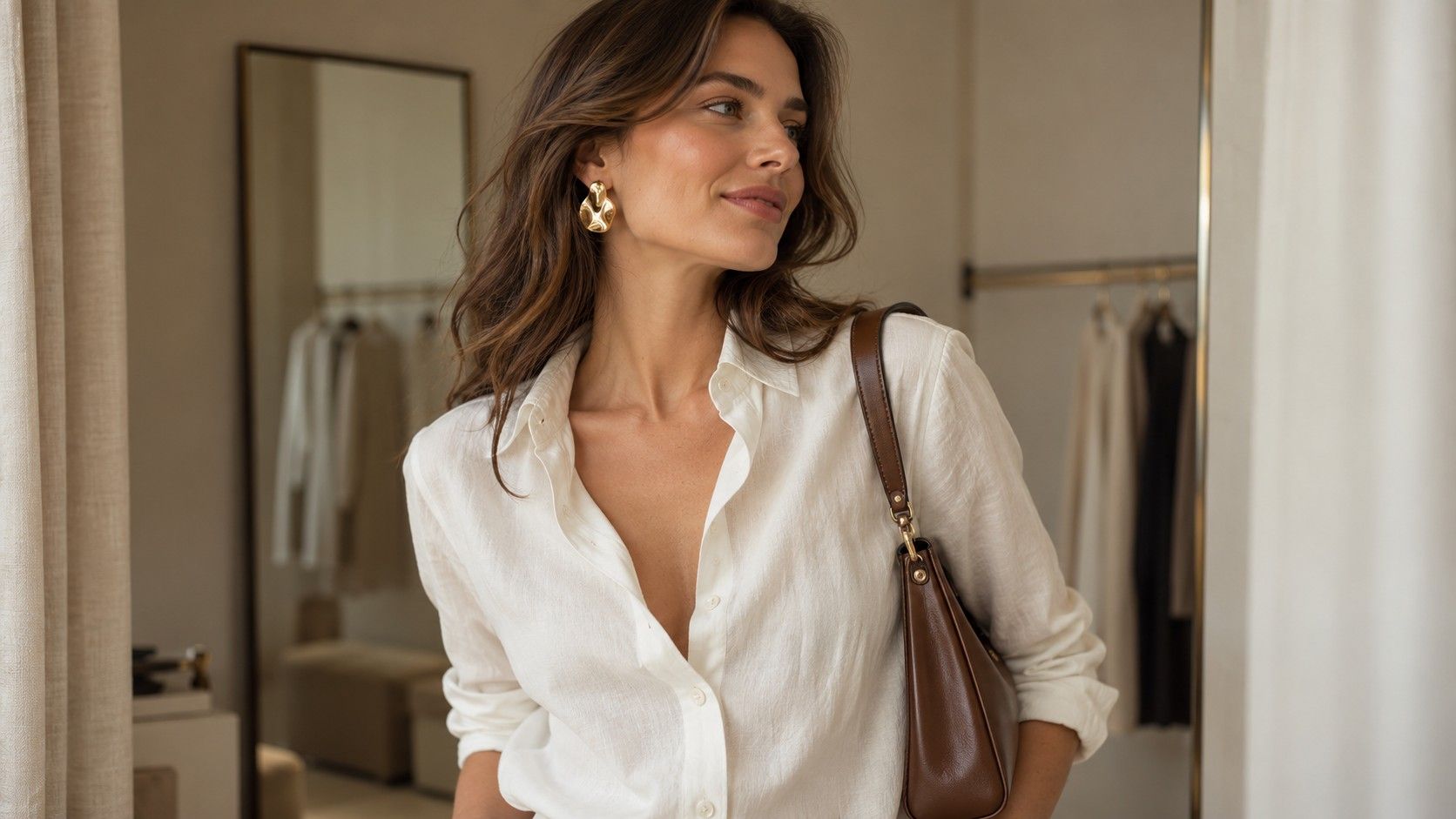
Name the exact conflict before changing the wardrobe. Is the problem the pale colour, the shiny surface, the neckline or the amount of exposed contrast? A cream satin blouse combines several features at once. If you dislike it, that does not tell you which feature caused the reaction. Compare it with a cream cotton blouse or a darker satin blouse to narrow the question.
Choose one actual outfit rather than judging two collections of pictures. Lay out the top, trousers, shoes and bag together. A romantic-looking reference might appeal because of its soft folds, while its pink colour leaves you cold. A geometric reference might appeal because of its clean fastening, even though you dislike its sharp colour blocks. Keep the feature you can identify.
Body shape and colour analysis address different questions in wardrobe planning. Garment fit involves room, length and movement; colour choices concern the shades and combinations you like wearing. Neither gives a reliable shortcut to the other. A waistband that pinches will still pinch in a favourite colour, and a comfortable jacket can be recoloured in your imagination without changing its cut.
Seasonal palettes are distinct from other personal colour methods. An essence name supplies no official shopping list; use it to describe preferences.
Translate a mood through texture instead of hue
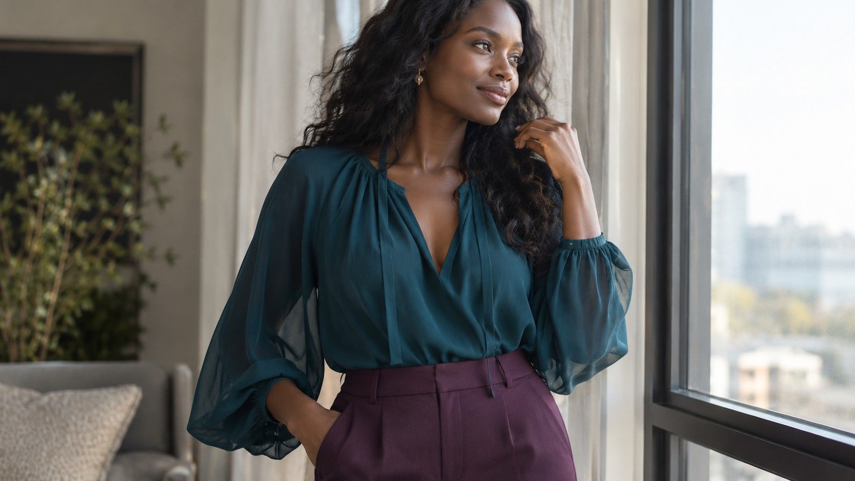
Texture can carry an idea when the reference colours do not appeal. If you like a softly draped outfit shown in pale peach, try the same sense of movement in plum, deep teal or charcoal. Look for fabric that forms gentle folds rather than assuming every garment in that colour will give the same effect. A stiff plum shirt and a fluid plum blouse behave differently.
A crisp graphic mood can also work without black and white. A sharply defined collar, smooth fabric and a clear-edged pocket can create structure in blue-grey or warm brown. Keep enough distinction between overlapping parts for the detail to remain visible. Two nearly identical dark fabrics may merge in low light, hiding the construction you wanted to borrow.
For a relaxed reference, compare brushed cotton, a loose knit and a matte woven fabric within one colour family. Their surfaces create different amounts of detail. A heavily textured cardigan may feel busy even with no pattern, while a smoother one can make room for a scarf. Touch the fabric and consider warmth as well as how it looks.
Shine is another separate variable. A satin scarf reflects light differently from a matte scarf of a similar hue, so it can stand out more without changing the colour family. Try the shiny piece in a small area if a full glossy blouse feels too prominent. The scarf may give you enough of the reference mood while fitting your daily routine.
Check fabric movement in a complete outfit. A soft top tucked into stiff trousers may bunch at the waist; a fluid skirt can catch against a rough coat lining. These interactions can make a colour combination seem less successful when the real obstacle is friction or bulk. Adjust the layers before deciding that the palette is the problem.
Try depth and contrast separately
Depth describes how light or dark a colour appears; contrast describes the difference between neighbouring elements. An outfit can use deep colours with little contrast, such as dark plum with charcoal, or light colours with little contrast, such as cream with pale beige. A pale top with dark trousers creates a more distinct boundary. These are useful comparisons even without a seasonal label.
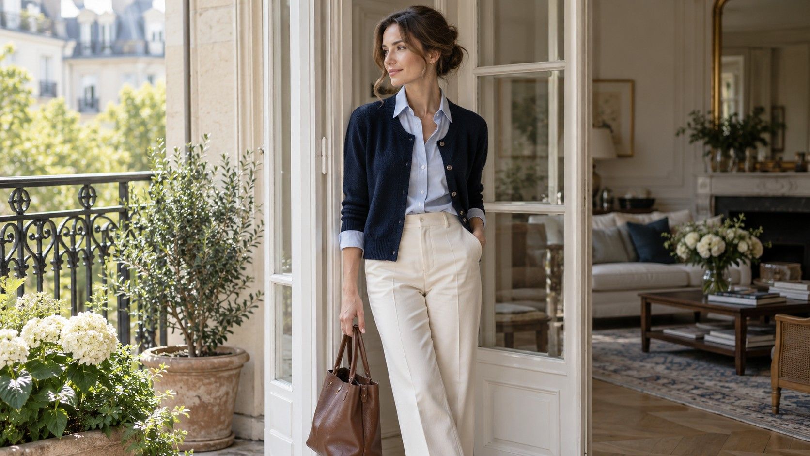
Start with the same dark trousers and compare a medium-value top with a very light one. Look at the waistline and the neckline separately. You may enjoy a clear light-dark change lower down but prefer a softer transition near your face. Add a cardigan in a related shade and see whether the new layer gives you the amount of contrast you want.
Keep the garment shapes similar while making this test. Changing a white fitted shirt to a roomy grey sweater alters colour, texture, volume and neckline together. A result you prefer will be hard to interpret. If matching garments are unavailable, use scarves or pieces of fabric to compare smaller areas of colour without replacing the whole outfit.
Pattern adds another level. A small print with similar lightness throughout may read as a texture, while a high-contrast stripe stays clearly divided. If a reference feels too sharp, try a stripe whose colours are closer in depth. If the look feels indistinct, introduce one darker button, collar edge or shoe rather than changing every piece.
View the comparison in ordinary daylight and in the indoor light where you will wear it. Avoid drawing firm conclusions from a single phone image, since exposure can change the apparent lightness of a top and background. You are looking for a combination that you enjoy repeatedly, not a technical proof that one exact contrast level belongs to you.
Keep a favorite color away from rigid rules
A favourite colour does not have to pass a classification test before entering your wardrobe. Decide how you want to use it. A bright red coat surrounds a large area; red shoes create a smaller accent; a lining may be visible only when you move. Each lets you enjoy the colour differently. None needs to be presented as a correction or a concession.
If you like a shade but dislike one garment, try another material or location. Yellow in a fuzzy knit can feel very different from yellow in a smooth bag. A vivid neckline may be more prominent than you want, while the same hue on a skirt feels easy to wear. Placement lets you control the amount of attention without abandoning the colour.
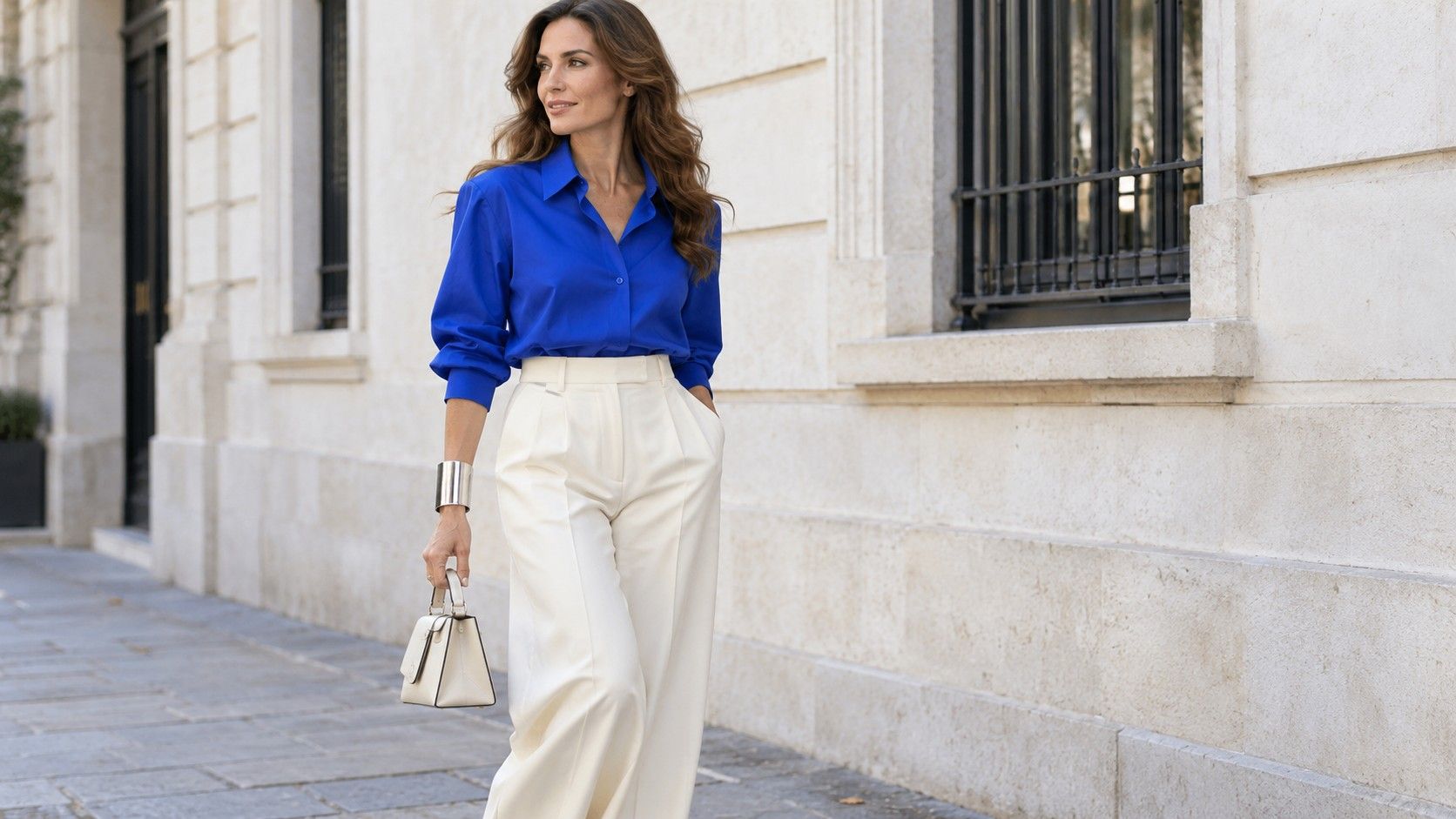
You can also change its neighbours. A bright blue shirt beside stark white trousers creates a different relationship from the same shirt beside soft navy. A scarf with a small amount of blue can connect the shirt to a brown coat. Use a repeat when it helps the outfit feel deliberate, not as an obligation to match three accessories.
Personal color guidance is easiest to use as a shortlist for experiments. If a suggested palette contains a version of green you dislike, there is no need to buy it. Try the colours you already reach for and notice where they work. Keep any named system separate from claims about personality, maturity or which bodies are allowed to wear a shade.
Before replacing a favourite item, check whether the concern matters in real use. An unfamiliar colour combination can need a second look, while an uncomfortable fabric will usually remain uncomfortable. Wear the outfit at home with the right shoes and coat. Give preference room to settle without turning a passing doubt into a shopping emergency.
Build two outfits from the same color family
Choose a colour family with enough pieces already in your wardrobe, such as blues. For one outfit, combine a fluid blue blouse, softly draped trousers and a smooth bag with a curved outline. Leave the neckline open if it is comfortable and keep the jewellery simple. The folds and curved shapes supply a gentle mood without relying on pastel colours.
For a second outfit, use a blue shirt with a defined collar, straight trousers and a structured bag. Turn the shirt cuffs neatly or leave a narrow cuff visible under a jacket. The colour family remains similar, but the edges and construction change. You can now judge which details you prefer without treating two different palettes as the deciding factor.
Accessory scale can reinforce either direction. A long fine pendant may extend the first outfit’s flowing line, while a compact earring may add a concentrated accent to the second. Try the opposite pairings too. A broad geometric cuff can give fluid clothes a useful interruption; a softly shaped bag can relax the crisper outfit.
Keep shoes, weather and daily activity in the comparison. A long fluid hem may need more clearance above the ground in rain, while a stiff collar may feel awkward under a zipped coat. Adjust the outfit to these needs before comparing its mood. Comfort and useful movement are part of personal style, not details to settle after the appearance is fixed.
Record the result in garment terms: soft folds in deep blue, a defined collar with low contrast, or a small bright accessory against matte fabric. Those notes help you repeat what worked in another colour family. A useful wardrobe can hold several moods, and each outfit can combine colour, texture and shape in a different proportion.